Arts & Literature _|_ Issue 11, 2018/19
Calligraphy – A Sacred Tradition
Ann Hechle, the distinguished calligrapher, talks to Barbara Vellacott about her work and her lifelong quest to understand the underlying unity of the world

Calligraphy – A Sacred Tradition
Ann Hechle, the distinguished calligrapher, talks to Barbara Vellacott about her work and her lifelong quest to understand the underlying unity of the world
Ann Hechle is a major figure in contemporary western calligraphy. Trained in the tradition of Edward Johnston and Irene Wellington, she is best known for her large scale, collage-like pieces which explore particular themes (Aspects of Language) or the deep meaning of texts (from the Bible, “In the beginning”; from the I Ching, Hexagram 22). The breadth of her subject matter reflects a personal journey which has immersed her in the sacred literatures of the world. In this interview, she gives us privileged access to her magnum opus, her ‘Journal’, in which she explores the principles of form and order – the sacred geometry – which are the well-springs of the creative process: the idea that “all things unfold out of, and are found within, unity”.
 ‘Calligraphy is more than fine writing.’
Within this simple statement lies an understanding of what it means to become a great calligrapher. The words could be applied to the teaching principle of one of the most famous modern practitioners of the art, Irene Wellington. She was a student of Edward Johnston, who famously revived the tradition of calligraphy in Britain in the early twentieth century and whose work and writings – most notably through his book Writing, Illuminating and Lettering – influenced a generation of artists and typographers. Ann Hechle was taught by Wellington and, now in her eightieth year but still actively working and teaching, she takes an honoured place in the tradition which began with these two great figures.
Calligraphy in the East, the Middle East and the West has always been a spiritual discipline, deeply embodied in the gestures of the body, the pressure of the pen and flow of the ink onto the open space of the page. It requires a quality of attention that is meditative. The demands of the words – both as letterforms and as meanings – can bring the wandering mind back to the moment, and when this kind of focus is found, the writing flows. The meditative practice involved is emphasised particularly in Buddhism, though it is present as an important strand in all spiritual traditions.
The role of calligraphers is often distinct from that of other visual artists, as they are frequently called upon to engage with significant events in human life where words are wanted to express deeply felt experience and emotion – birth, death, friendship, to enshrine memory, to celebrate achievements. The words chosen are full of meaning, and in contemplating and expressing them in writing, the calligrapher is performing a spiritual service to the community. A truthful engagement with words is absolutely required; it is said that “good writing makes the truth stand out” (a saying attributed to the Prophet Muhammad).
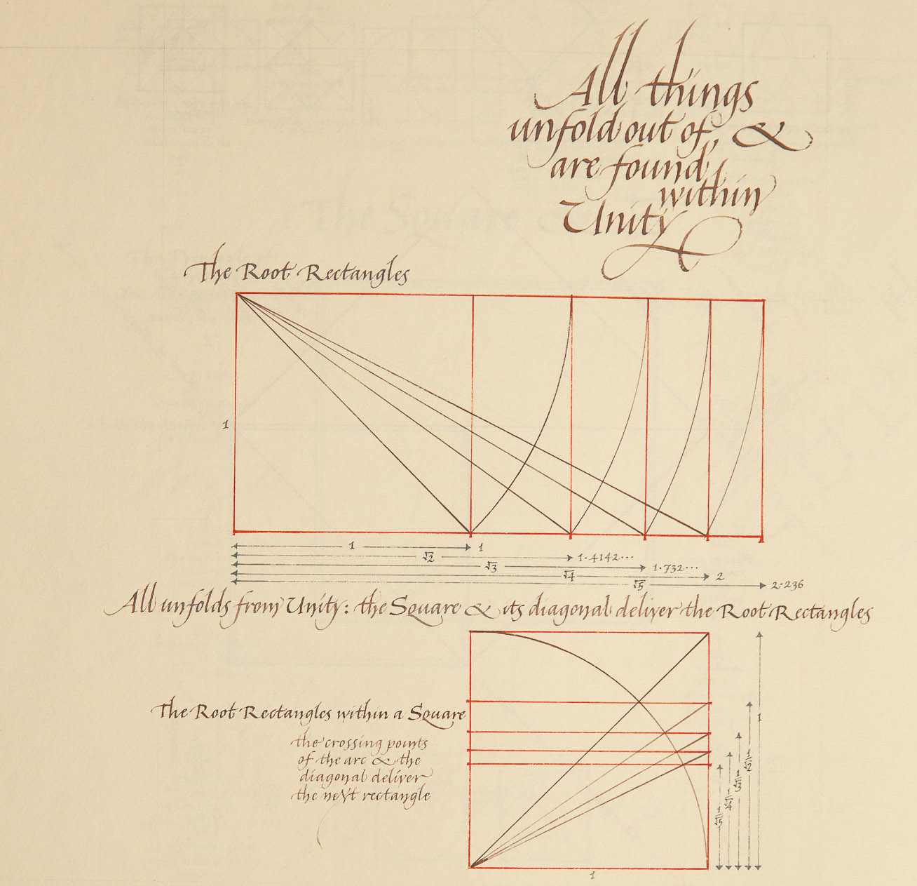
Page on Unity from ‘Figures of Speech’. Photograph © Mark Simmons Photography [/].
Move your computer mouse over the image to enlarge
Energy and Flow
All calligraphers must work with a flow of energy if their work is to be ‘alive’ – which is not the same as being formally perfect. This is most overt among Chinese calligraphers who consciously work with energy flows in the body. In Taoism it may be understood as working with ‘natural flows’, and in Christianity as ‘incarnation’. It was this aspect which first drew Ann when, at the age of thirteen, she had chosen calligraphy as a craft option at school. “I fell in love with it,” she remembers; “it was the movement, the flow of the ink out of the pen – it was absolutely magical. It is the most magical thing, that the square-edge pen makes this ribbon shape – you’re in touch with it.”
In those school days, an inspirational teacher got her going and ‘lit the spark’, but then calligraphy itself carried her forward with an excitement which had an extraordinary physicality. She would sneak into the art room after hours to work away at her writing, and persisted even though, as she realised later, she was being taught badly, without any real awareness of letterforms. She left school without A-levels to go to the Reigate School of Art, determined to be a calligrapher. From then on there is a single-mindedness in her story as she overcame prejudices and obstacles to achieve her goal.
And there were indeed obstacles. There was the question her parents asked her – ‘How can you make a living from calligraphy?’ – because a well-known calligrapher at the time had told them it was not possible. Then she had to get through the terrors of art school where, having come from a ‘posh’ background wearing tweed skirt and pearls, she did not fit in and indeed was laughed at. “But in fact, it was the best thing that ever happened to me.” Life, it seems, was roughly knocking her into shape.
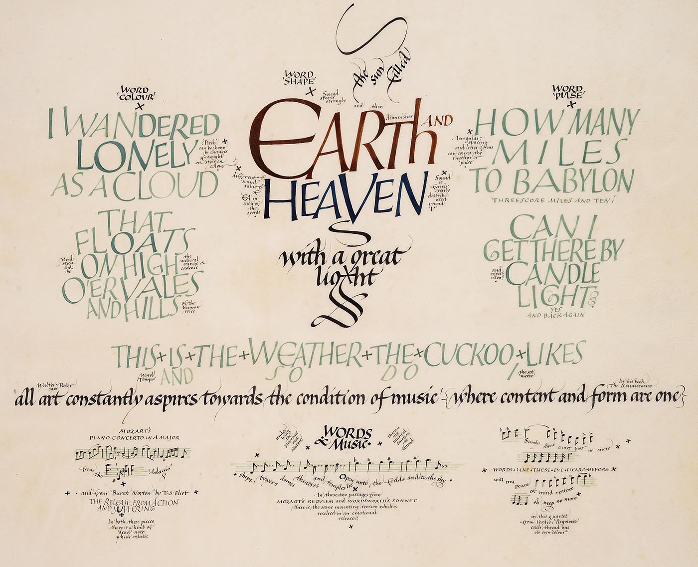
Panel on sound from the Aspects of Language project. Each of the four panels explores a topic in language: rhythm, narrative, rhyme, and sound. In the central motif here – ‘Earth and Heaven …’ taken from the poem March by Edward Thomas – the vowel combination ‘ea’ is rendered differently in each word. Image © Ann Hechle/Crafts Study Centre, University for the Creative Arts.
Move your computer mouse over the image to enlarge
The Truth of the Thing
The turning point came when Ann enrolled at the Central School of Art. There she came into direct contact with the living tradition of calligraphy taught by Irene Wellington who, having been trained by Johnston in the art of formal writing with an edged pen, in her turn opened up calligraphy to becoming a mode of personal artistic expression. Ann found that her way of teaching was quite unlike conventional calligraphy training, which was usually done through exemplars and endless practice. Wellington’s students studied the best old manuscripts, just as Johnston had done, but at the same time they were plunged headlong into their own piece of work.
It was very brave of Irene Wellington because it often took us a long time to produce finished work, and there wasn’t necessarily a nice portfolio at the end of term. Her students had to understand ‘the truth of the thing’, and not be diverted into simply showing off skill. It took us a long time to understand and absorb what she was saying because she was giving us a way of working, not merely helping us to resolve the present project.
Ann started an ambitious collage – an art form for which she has become famous. But she laboured over this first piece for two years and at many points nothing seemed to be working. “Of course it didn’t,” she now realises: “I was learning.” Through this experience she began to understand some deep principles, and the basic rules of relationship in design – that if you move one thing, you move everything; the parts cannot be separate from each other or from the whole.
Just as the colour green looks different depending on the background, so any part looks different when it is placed in relationship to the others. I call this the ‘Janus effect’ after the Roman God who faced both ways. Every element in the visual vocabulary has two aspects; what it is and how it is behaving; an absolute and a relative aspect; an unchanging and a changing. And both are encoded in the same image. This means that there need only be a few elements involved, but they are all working very hard.
This is a teaching not only for calligraphy, but for life. We may have a vision of a whole but, paradoxically, we do not know the end at the beginning; we create as we go along.
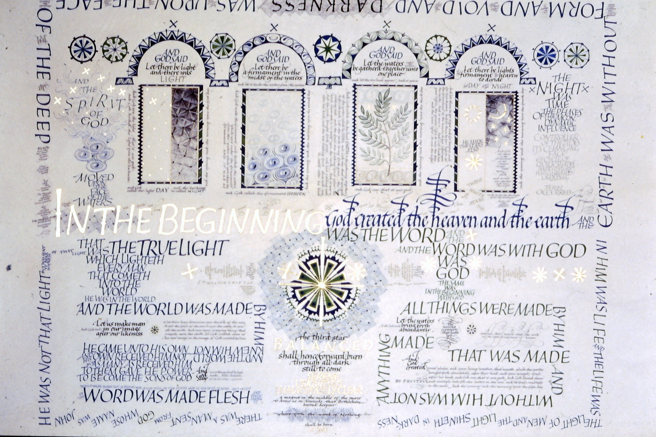
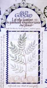
Large work: ‘In the Beginning’. Image courtesy of Ann Hechle.
Move your computer mouse over the image to enlarge
Freedom and Form
Under Wellington’s guidance, Ann was learning to use calligraphy not simply for conventional formal purposes but as an aspect of language – as a way of expressing the feelings and meanings of words. But this was the 1960s, and a reaction against convention and restrictive forms was blowing up everywhere. For calligraphers, the tension between the given form – the recognisable letter – and the freedom to express feeling and insight could be more acute than in other visual arts because the letterforms have to be, somehow, readable. This tension was borne upon Ann when after her training she taught part-time at the Sutton School of Art: “My students all wanted to be artists. They certainly didn’t want to learn about Roman capitals!” Both teacher and students intensely disliked this brief period when meaning and form were seen to be in such stark opposition.
It was a long time before Ann began to do really ‘serious work’ as she calls it. She spent a year in the Middle East and four more summers drawing archaeological finds in Iraq and Iran; and in between times she was scraping a living in London, and experimenting. But she eventually knew that she must use her wonderful training in calligraphy. With this conviction, while doing regular teaching work and commissions, she was invited to join with thirteen other craftspeople working on a project at the Victoria and Albert Museum which led, in 1979, to a Calligraphic Sampler. She then started work on producing her own big, demanding pieces.
One of the first of these was based on the biblical words, ‘In the beginning…’, which appear at the start of Genesis and again in St John’s Gospel. It began as a small piece, but…
… then I had a sudden rush of inspiration for a much bigger piece, and I did a rough in four days, working flat out, gumming down ideas. What fired it was the discovery of a poem by David Gascoyne [/] called ‘The Three Stars’. Then, after some trials, I realised I couldn’t do this big piece – I wasn’t up to it. I had to do seven more years of work before I felt I could do it.
The finished work interweaves the words ‘In the beginning…’ with the Gascoyne poem –
But shining everywhere
The third star balanced shall henceforward burn
Through all dark still to come, serene,
Ubiquitous, immaculately clear;
A magnet in the middle of the maze, to draw us on
Towards that Bethlehem beyond despair
Where from the womb of Nothing shall be born
A Son.
It is in colour – subtle deep blues and green – with gold. For Ann it explores the themes of birth, death and hope, though those who take the time to contemplate this complex and utterly beautiful work will find their own thoughts in it. I ask her where the ideas for her works come from; whether it is the specific words which inspire her or the subject matter in general? She answers: “I have to wait till an idea comes to me. Because if I endlessly think, ‘Oh, I’d like a good idea – maybe I should do something on the Green Man because it’s interesting…’ – I can’t do it. I can’t invent an idea, it has to come to me.”
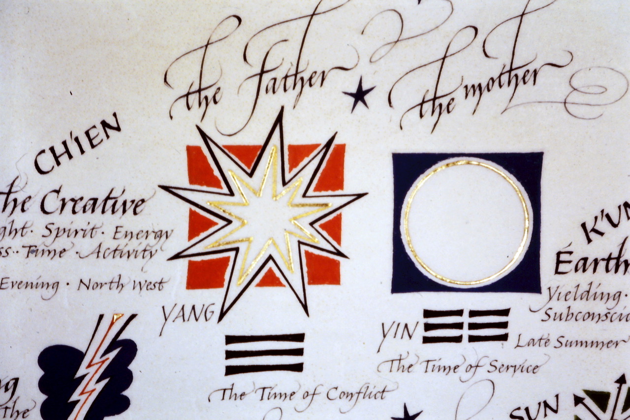
Detail from the Image of Grace project, which explores the meaning of Hexagram 22 of the I Ching. Image © Ann Hechle/Crafts Study Centre, University for the Creative Arts.
Move your computer mouse over the image to enlarge
Divining the Next Step
Over the next few years, Ann executed various large pieces, but then a moment came when she felt she had run out of ideas for using calligraphy as a tool to express language; she had explored it in many ways in these large works and something seemed to have been completed. Now she felt she needed a new direction.
Her response was to start reading more widely. One fruitful line of work was with the ancient Eastern book of divination, the I Ching. She consulted it and received the message, ‘The superior man eats and drinks while he waits’, from which she understood that she was not ready – but for what? Another reading said: ‘Supreme success’. “Of course, I had no idea what it meant”, she confesses. But then, in researching the meaning of the images, she came across Number 22, the hexagram for the imaginative arts, and this inspired her to produce another large piece, Image of Grace [/]. While continuing her regular teaching and commissions, over the next six years she read many commentaries on the I Ching, uncovering its multiple layers of enigmatic wisdom.
She also returned to questions which had been raised earlier in her career. This was a period when calligraphers were experimenting with new, expressive forms of lettering, and one big question had been emerging: what is freedom? Traditional calligraphic practice said that you should know the letterforms and understand their structure. But underlying this lay a deeper question: not just, ‘What is a good letterform?’ but ‘What, intrinsically, is a good shape?’ Things were changing in the world of calligraphy, with calligraphers feeling free to invent their own shapes and forms. Was it all subjective?
In pursuing these questions more deeply, Ann ventured into new areas of enquiry and study. First there was the matter of Nature. She read On Growth and Form by the mathematical biologist Wentworth D’Arcy Thompson, published in 1917, to explore the question, ‘What does Nature tell us about form and shape?’ This extraordinary and seminal book expounds how form comes into being: it reveals that there are shapes and patterns in Nature that seem to be mathematically and aesthetically pleasing, even ‘right’.
D’Arcy Thompson mentions the influence of Greek thought, and Ann followed this up; for some years she attended courses with the sacred geometer and architect Keith Critchlow [/], going to various lectures and discussions at Glastonbury, and putting herself through a course of practical mathematics at home. She was introduced to the famous ‘golden proportion’, the significance of number, and some of the vital mathematical principles that underlie the cosmos and the sacred buildings that reflect it. She also followed the crop circle phenomenon, as many beautiful geometric designs related to these were appearing in the landscape.
These discoveries were deeply felt:
It brings tears to your eyes; these relationships are so profound yet so simple… mathematics reveals an order beyond what one can express. I find it really moving.
A book that greatly impressed Ann at this time was A Painter’s Quest: Art as a Way of Revelation by the artist Peter Rogers. He understood that painting is a way of knowing, and of dealing with, relationships, and that the artist is doing something that is true to life whilst also breaking through to something deeper. In that process, the calligrapher as an artist has to keep a vision of the whole. In spiritual terms, one has to love God first, and everything else flows from that. However, decisions have to be made all the time about detail, and how parts relate to each other and to the whole, so there is the paradox of holding overarching vision and ‘minute particulars’ (as the great visionary William Blake put it). Vision without form doesn’t materialise; form without vision is dead.
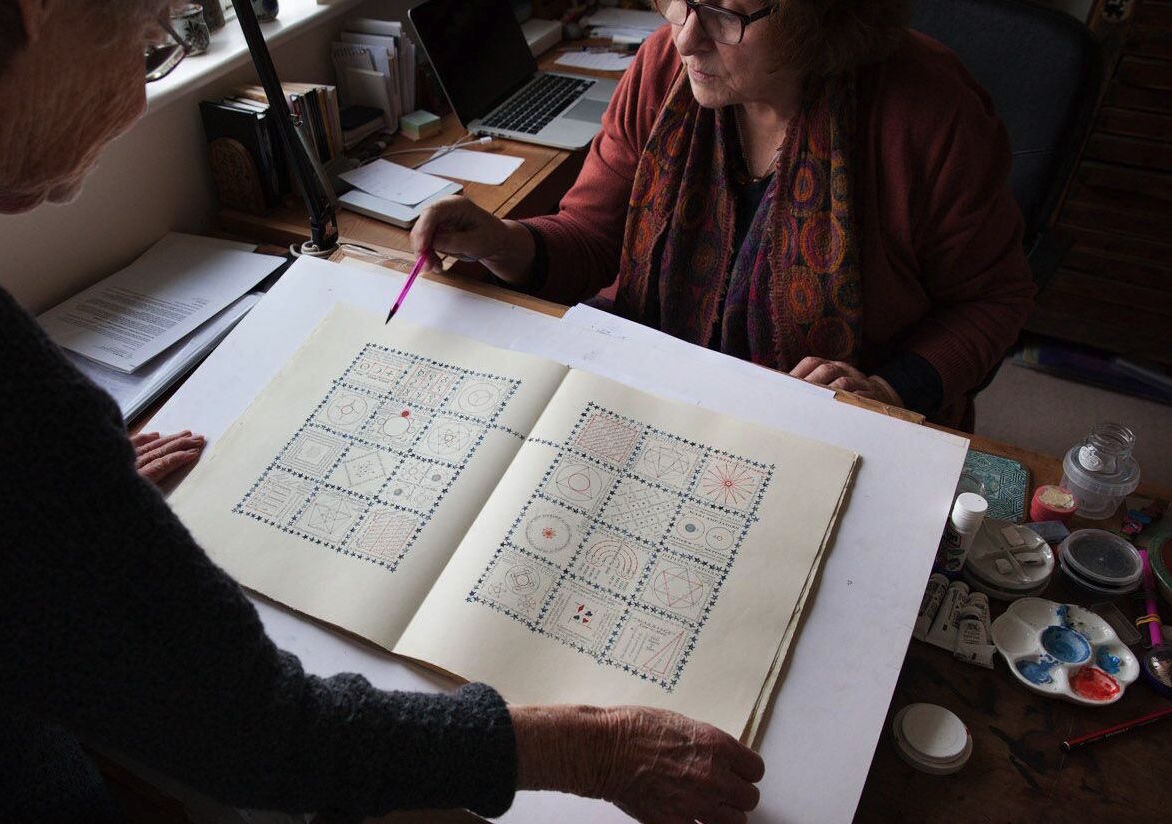
Ann showing the page on the planets in ‘Figures of Speech’ to our editor, Jane Clark. Photograph © Mark Simmons Photography [/]
‘Figures of Speech’
The outcome of all this intensive, wide-ranging study and reflection could be seen in retrospect to be leading up to Ann’s magnum opus – her ‘Journal’ which she has named ‘Figures of Speech’. A fellow calligrapher who was setting up some exhibitions for the Edward Johnston Foundation wanted to commission some work and he suggested doing something on the creative process. “I didn’t have any idea – I just started, not really knowing what I was doing, and then it unfolded in the most extraordinary way.” In fact, this beautiful book came to be an expression of the principles of art – indeed, of life – that had been developing in those years of deep enquiry.
A few technical details about this journal have some emotional as well as aesthetic significance. Irene Wellington had bequeathed to Ann some high-quality, hand-made paper – a light cream colour, and quite substantial so that both sides could be used– together with boxes of ‘Rex’ nibs, which are metal but have a sensitivity and flexibility nearer to a quill than others. These are the materials that she used.
There are 72 pages to the Journal, each 36cm high by 29cm wide, plus three pages of introduction and acknowledgements. The introductory essay, which is purely text, is an essay drawn from A Painter’s Quest about art as ‘a way of knowledge’ and the process of holding a unity of vision while working with opposites.
The subsequent pages, all double openings, express in calligraphy and design, colour and pattern, and in detail, the fruits of Ann’s personal quest. The first introduces the archetypal shapes of the circle and the square, their symbolising of unity in its heavenly and earthly forms, with the crossing of the square opening to multiplicity.
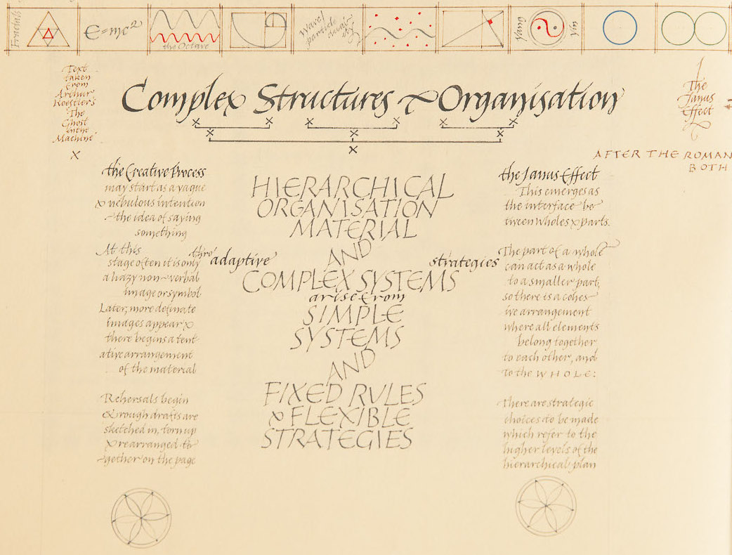
Detail from ‘Figures of Speech’ on complexity and organisation. Photograph © Mark Simmons Photography [/].
Move your computer mouse over the image to enlarge
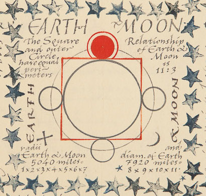
The following pages trace, expound and illustrate with geometrical drawings, fundamental mathematical and geometrical relationships, the relationships of sounds in music, the significance of number, the golden proportion, and the underlying forms of the cosmos.
I based the book really on the first three prime numbers, which are two, three and five – not counting one, because one is about everything. Five includes the golden proportion. I also included the square roots of 2, 3 and 5. Doing this made me read much more about geometry and maths, and I learnt how the planets – the movement of the planets – can be framed by very simple geometry.
But as she went on, she discovered an even wider perspective.
I thought at first that mathematics must be the basis of everything, but then I realised that it is the principles behind mathematics, not mathematics itself. And if they are in maths, then surely they must also appear in myth – in the ancient tales of the world.
So there is a section of the book devoted to myth as well, showing how the same deep principles appear in the great stories of humanity, with quotations from the poets, mystical philosophers and different spiritual traditions. There is a page devoted to Death and Resurrection, for example.
The Journal culminates in the final double page on the theme of the ‘paradox’ – contraries that are both true and absolutely necessary. It is a kind of summary and personal reflection on the journey taken, and sets out by text and illustration, in little squares and rectangles, twenty paradoxes. Some are expressed in geometry, some in poetry and sacred texts, some in a combination of these.
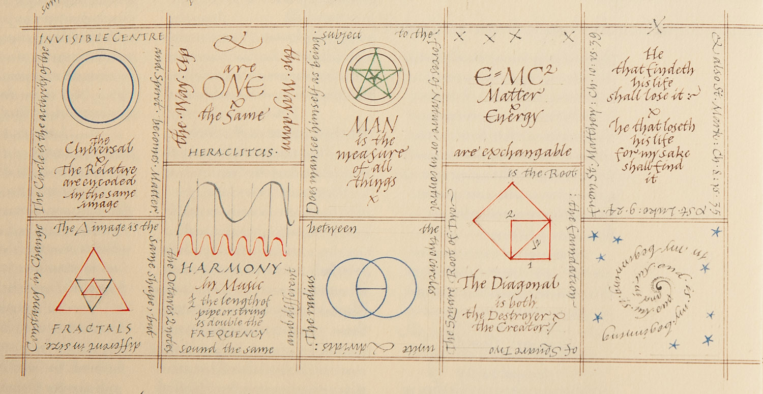
Detail from ‘Figures of Speech’ on paradox. Photograph © Mark Simmons Photography [/].
Move your computer mouse over the image to enlarge
The paradoxes may be familiar, but there is something ‘extra’ and exquisite about contemplating them together in this form. Ann writes at the end of these pages:
What I seem to be doing in all these works is gathering together apparently opposing principles and bringing them into harmony, though the subject matter was always different: a Bible text, a nursery rhyme, the Chinese Book of Changes, for instance. So this activity must reflect some inner need within myself as I seem to need to do it again and again.
In the introduction to one of her study days, she writes further about the way in which paradox feeds into the process of making a piece of calligraphy:
The Janus effect is used by nature in many different ways and situations, and this gives me a curious sense of belonging. As I grapple with putting letters, words and drawings together, I am using strategies that belong to a much bigger and grander world which are part of the universal law. The experience I am trying to convey is a feeling I have when standing beneath the stars on a clear winter’s night: that I am conscious of my unique personal identity but at the same time of my absolute insignificance – the part and the whole, and that the two things are connected.
All who have explored these themes will recognise and appreciate something of their own discovery in the pages of this Journal. Those for whom the thoughts are fresh may feel the beauty of the calligraphy and the sense of a truthful journey drawing them into such exploration for themselves. Today the availability of ideas through information technology and travel as well as books, open up exciting times for calligraphers – and all of us – in being open to what is new while still connected with a living tradition.
My thanks to calligrapher Ewan Clayton for discussions about calligraphy as a spiritual discipline; to Ann Hechle and The Crafts Study Centre for providing us with images; and to Mark Simmons for his photographs.
Image Sources (click to open)
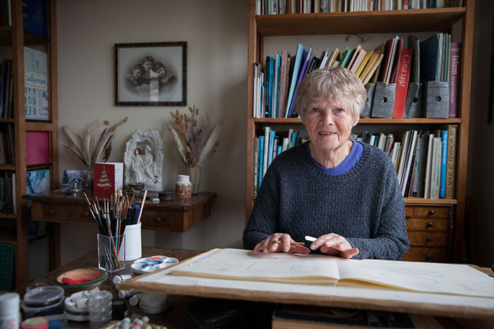
Banner: Ann Hechle in her studio in Bath, UK. Photograph © Mark Simmons Photography [/].
First insert: Detail from the large panel, ‘In the Beginning’, courtesy Ann Hechle.
Final image: Detail from ‘Figures of Speech’ on the geometry of the planets, based upon a diagram discovered by John Michell. Photograph © Mark Simmons Photography [/].
Other Sources (click to open)
For a good overview of Ann’s career in calligraphy see ‘Ann Hechle:calligraphy as experiment, expression and vocation’ by Sophie Heath on https://www.vads.ac.uk/learning/csc/hechle/essay.html#fig9.2
Edward Johnston, Writing, Illuminating and Lettering (John Hogg, London,1917; Dover Publications, 2017)
“Good writing makes the truth stand out”, quoted by Neil MacGregor in ‘Living with the Gods; the power of images”, BBC Radio 4, 7th December 2018. (See https://www.bbc.co.uk/programmes/m0001gb6)
David Gascoyne ‘The Three Stars’ in David Gascoyne, Selected Poems (Enitharmon Press, 1994)
Peter Rogers, A Painter’s Quest: Art as a Way of Revelation (Bear and Company, 1987)
Wentworth D’Arcy Thompson, On Growth and Form (Cambridge University Press, 1917; paperback abridged edition 2014)
John Martineau, A Little Book of Coincidence in the Solar System (Wooden Books, new edition 2002)
John Michell & Allen Brown, How the World Is Made: The Story of Creation According to Sacred Geometry (Thames and Hudson, 2012)
Barbara Vellacott
With a background in adult education and overseas development issues, Barbara Vellacott now teaches poetry. She enjoys encouraging the reading of poetry – aloud wherever possible – as a form of personal and shared engagement with life, which is musical, emotional, intellectual and spiritual. Particular interests are William Blake and the English Romantic poets. In recent years the study of Ibn ʿArabī has also been a great inspiration. She is also a calligrapher who exhibits regularly with the Oxford Scribes.
Email this page to a friend
FOLLOW AND LIKE US
——————————————
——————————————
——————————————
FOLLOW AND LIKE US
If you enjoyed reading this article
Please leave a comment below.
Please also consider making a donation to support the work of Beshara Magazine. The magazine relies entirely on voluntary support. Donations received through this website go towards editorial expenses, eg. image rights, travel expenses, and website maintenance and development costs.
READ MORE IN BESHARA MAGAZINE
A Thing of Beauty…
Barbara Vellacott contemplates the indescribability of beauty in Dante’s Paradiso
Painting and the Contemplative Life
Artist and psychotherapist Benet Haughtont on the spiritual vision which underlies his work
An Artisan of Beauty and Truth
Etel Adan – artist, poet and novelist – talks about her painting, her life and her relationship with the great mystical philosopher Ibn ʿArabī
A Thing of Beauty…
Sacred geometer Dave Apthorpe praises the Sokullu Mehmet Pasha Mosque in Istanbul
READERS’ COMMENTS

Fantastic!!! Thanks for sharing.
To know more about your future, you should visit a good website of fortune telling that covers all the subjects related to the future prediction’s : astrology, numerology and clairvoyance will help you to obtain the answers to the important questions you may have.
A most inspiring essay. I was taught by Ann Hechle and have always been inspired by her philosophy and appreciate her friendship
I couldn´t open the link to image and other sources. The links rendered mistakes or pages no longer available.